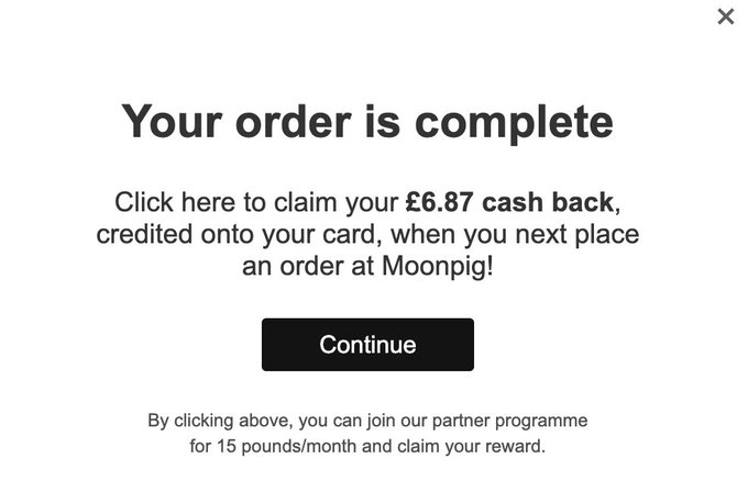
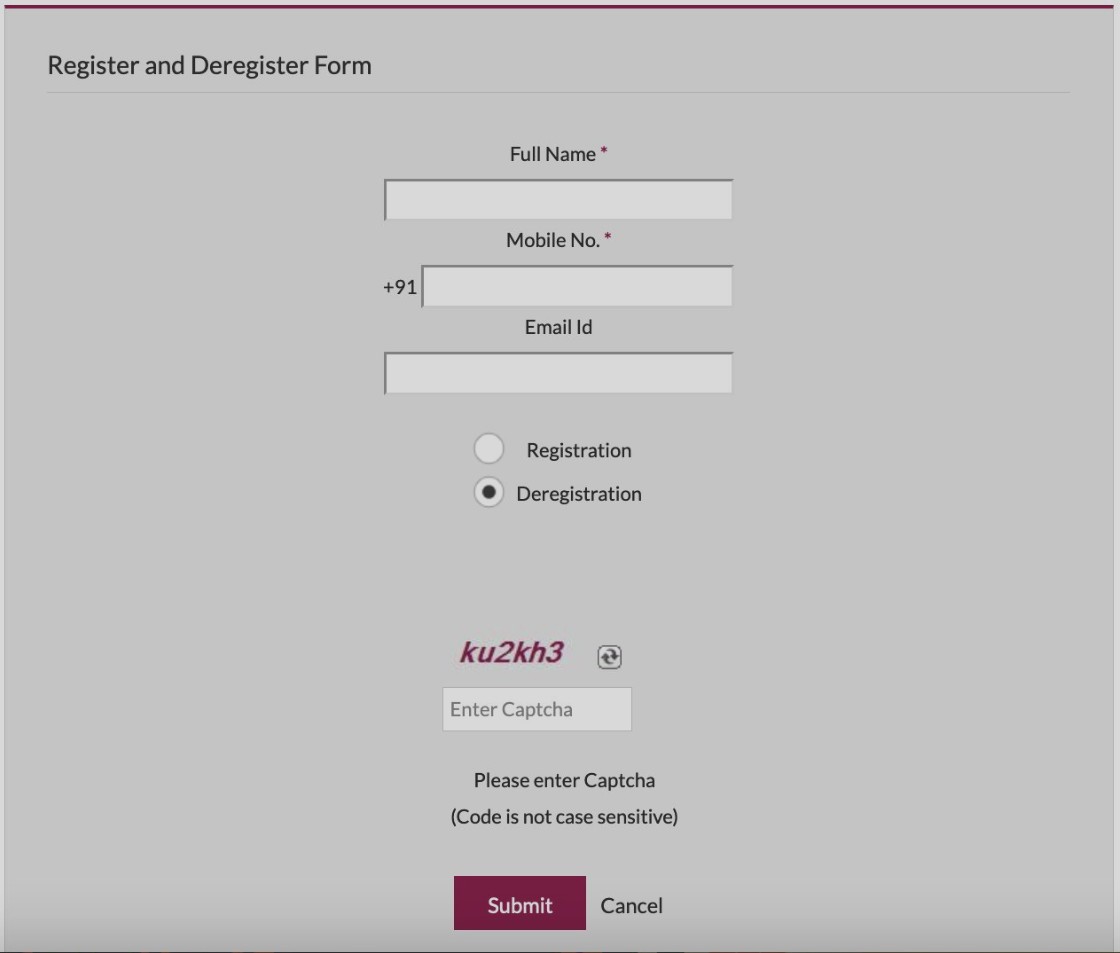
Do you ever feel like you’re being lied to? Maybe when you’re shopping online and the site seems to be making things up as it goes?
Whatever the case, dark patterns are sneaky design tricks companies use to deceive customers.
Whether email marketing, website design, or even social media marketing campaigns, dark patterns can ruin your experience and put your personal information at risk.
So before it’s too late, learn all you can about these insidious design techniques and put a stop to them!
What are dark patterns?
UX (User Experience) design is about creating a user-friendly user experience. But what happens when companies use deceptive design practices to deceive their customers?
That’s where dark patterns come in – deceptive design patterns that companies use to deceive users.
Top five dark patterns most companies use to deceive customers.
User experience (UX) design creates a user experience that is easy, user-friendly, and convenient. But why are companies resorting to dark patterns to achieve these goals? Here are the top five dark patterns that companies use to deceive their customers:
1. To trick customers into buying a product they don’t need.

When designing a UI/UX, be aware of dark patterns. Manipulative design techniques deceive customers into buying products they don’t need.
These tricky tricks include bait and switch, delayed shipping, upsells, Etc.
Designers are aware of avoiding dark patterns and creating an interface or UX that is user-friendly and ethical.
2. To make their customers hard to cancel subscriptions.
Dark patterns are designed to deceive or mislead customers in some way. Such as making it difficult for users to cancel their subscriptions and forcing them into long-term contracts they don’t want.
Many types of dark patterns, and companies use them because they know that customers are often too trusting of them.
3. To capture personal data without consent.

There are many ways companies capture personal data without the user’s consent. Such as collecting credit card numbers, addresses, and other personal information.
Companies use this data to improve the user experience and increase conversion rates. However, dark patterns can have a hidden cost – for example, higher customer churn rates or lower conversion rates.
Dark patterns happen when companies deceive users into providing their personal information in a way that isn’t transparent or easy to understand. Consequently, customers feel taken advantage of and frustrated with the whole process.
4. To get users to sign up for their newsletter.
Some unethical marketers use deceptive tactics to get users to sign up for their newsletter or other email-based offers.
The sign-up can involve:
They are tricking users into downloading malware or other malicious software. They are collecting sensitive data like credit card numbers.
They are even increasing engagement by coercing users into participating in surveys.
Users should pay attention to any email that asks for personal information. Always check the sender’s legitimacy and ensure you know what you’re signing up for!
5. To boost the user’s emotional state.
There are various ways that companies use emotional manipulation to get users to take actions they might not want to.
For example, online ads may deceive users into thinking they need a product or service. They might also use persuasive tactics such as presenting information interestingly or entertainingly to get the user’s attention and holding it until certain conditions have been met (such as clicking on a link).
These strategies somehow aim to boost user emotions- usually for the company’s benefit.
This manipulation can often backfire – resulting in anger and frustration on behalf of the user instead of conversion rates.
How do dark patterns work?
User experience (UX) design is about creating a positive user experience. However, dark patterns can undermine this goal and negatively affect businesses.
Dark patterns are deceptive design practices that businesses use to manipulate users. The goal is for customers to get into performing actions they might not otherwise take.
These can harm core features of user experience, such as forms and notifications.
As user experience designers, it’s essential to be aware of these patterns and how they can adversely affect users. It’s also important to be vocal about dark patterns’ negative effects so businesses can effectively make informed decisions about designing the user experience.
How do I spot a dark pattern in UX design?
You must be observant and eagle-eyed to spot a dark pattern in UX design. Look for anything that seems counterintuitive or confusing.
For example, if a design presents you with a hidden menu option after clicking on a link in an email, that’s probably a dark pattern.
Forced to sign up for an email subscription before reading the email that’s also a dark pattern. Dark patterns often include hidden menus, unexpected pages, intrusive ads, and lengthy sign-up forms.
If something seems out of place or uncomfortable, it’s probably a dark pattern. Be observant and notice how users interact with your design. It might be worth redesigning if there are frequent complaints or red flags.
Dark designs are usually present within web app designs. It is important to work with ethical web designers to avoid deceiving users away editing their payment method.
How can I ensure that my designs don’t use any dark patterns?
It is crucial to avoid creating traps for users. Design choices such as hidden costs, unexpected charges, and long sign-up processes can all be examples of dark patterns.
You should also ensure that all information is easily accessible and that the user interface is easy to understand. The UX Design keeps everything organized and in an easily-accessible location. Use clear and concise language and design visually appealing elements.
Finally, ensure you are not using deceptive or manipulative tactics in your designs. These tactics can include hiding fees and requiring more information than users expect or tricking users into completing unnecessary steps.
What are some companies’ most common dark patterns to deceive their customers?
Some of the most common dark patterns companies use to deceive their customers are as follows:
Sneaky contract negotiations
Companies will often negotiate contracts in a secretive or non-transparent way, making it difficult for customers to understand what they agree to. This can lead to hidden fees and delayed delivery times.
Case: The product asks for your email or social media permissions under the pretense that companies will use it for a desirable outcome.
However, once the permissions are given, the product uses them to spam all your contacts.
Bait and switch marketing tactics
Companies use persuasive techniques to lead unsuspecting customers into buying a product or service. However, these customers might later regret this decision and ask for a refund or return the product.
Case: Credit Karma tricked people by giving them false “pre-approved” credit card offers. This made people more likely to click through ads on their site.
Making too many demands for feedback before offering a solution
Many companies make it difficult or impossible for customers to provide feedback before receiving a solution. This can cause more problems for customers in the long run.
Case: Mobile Application Rosetta Stone is a program that requires a lengthy process to create an account. Once users create an account, they ask to choose from a selection of lesson plans. Then users are asked to sign up for a trial account, which includes providing payment information.
Conclusion
UX design helps companies design user interfaces that are both user-friendly and effective.
Many companies use dark patterns to deceive their customers. These deceptive design practices involve tricking users into doing things they wouldn’t do.
By understanding how dark patterns work and why companies use them, you can help avoid deception.
⸻

Joshua Yap
Growth & Marketing Lead at Zensite
Joshua spends most of his days thinking about growth in the past five years. He primarily writes and talks about marketing growth strategies. At Zensite, he puts the talk to the walk by building marketing strategies that help people to discover their design solution.


