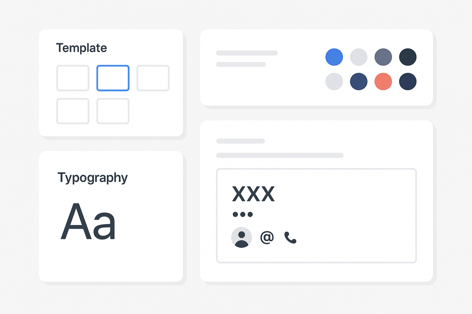
Mobile devices have become the primary way people check email, making responsive signature design a critical detail. A signature that looks clean on desktop, but breaks on mobile, can instantly damage your credibility and reduce engagement. With limited screen space and varied client support, responsive formatting ensures your signature remains readable, functional, and visually aligned with your brand across every device. In this article, we explore how to create and maintain mobile-friendly email signatures that adapt beautifully and perform consistently.

Why mobile responsiveness matters in signature design
More than half of email opens now occur on smartphones. If your signature isn’t designed for mobile, recipients may see misaligned elements, broken images, or unreadable text. These visual issues can reflect poorly on your professionalism and reduce trust in your communication.
A responsive email signature also ensures usability. When recipients can easily tap your phone number, visit your website, or follow your social media links without zooming or scrolling, they’re more likely to engage. For inspiration on how to make your signature both functional and visually appealing, explore some email signature design ideas — this small detail can have a significant impact on brand perception.
Key features of a mobile-optimized email signature
To ensure usability and clarity on mobile, include:
- Font sizes that remain legible on smaller screens (min. 14px body, 16px name)
- Single-column layout to avoid horizontal scrolling
- Icons and images sized to fit mobile width (20–32px)
- Tap-friendly links and buttons with enough spacing
- Limited line length to prevent wrapping or truncation
These adjustments keep your signature visually clear and easy to interact with, even on smaller screens. Avoid condensed designs or overly complex formatting that can break on different email apps.
Tools and techniques for building responsive signatures
There are two main approaches: using a signature generator or creating your signature manually in HTML. Signature generators offer templates and built-in previews for mobile, which is useful for non-technical users. However, for full control and fine-tuning, hand-coded HTML is often more flexible.
When building manually, rely on inline CSS rather than external stylesheets, as most email clients strip out embedded or linked styles. Hosting images on a secure HTTPS server or encoding them using base64 helps prevent loading issues. Avoid relying solely on media queries, as many email clients do not fully support them.
Always test your signature in real environments—both desktop and mobile—before deployment. Tools like Email on Acid or Litmus can help preview your signature in dozens of email clients.
Common mistakes that affect mobile performance

Despite good intentions, many signatures fail due to common errors that hurt mobile readability and performance. Overly large banners, columns that don’t stack properly, or tightly packed text blocks make it difficult for users to read or click.
Avoid using table-based layouts with complex rowspan and colspan attributes—they often break on mobile. Also, keep line height generous (at least 1.4–1.6) to avoid visual clutter. Touch targets should have at least 48px of padding to allow easy tapping.
Issues that compromise mobile display:
- Embedding large images or banners that scale poorly
- Using side-by-side columns that collapse or misalign
- Ignoring line height and padding, leading to visual crowding
- Overloading with links, making tapping difficult
- Relying on fonts that don’t render well on mobile systems
These mistakes can make even a well-branded signature appear broken or unprofessional on mobile devices.
Best practices for maintaining responsive signatures
A strong mobile signature starts with thoughtful layout and continues with consistent maintenance. Limit the width of your signature block to 320px or less to ensure it fits within screen boundaries. Keep all elements vertically aligned to support stacking, and avoid floating items or fixed positioning.
Use standard web-safe fonts like Arial, Helvetica, or Verdana to avoid display issues. Images should be optimized for web, compressed without loss of quality, and never oversized.
If you update your branding or contact details, recheck your signature on multiple devices. A change that looks fine in one context may affect spacing or alignment in another. Finally, use SVG or high-resolution PNGs for icons to ensure they remain sharp on retina screens.
Frequently asked questions
What’s the ideal size for a mobile-friendly email signature?
A width between 280–320px ensures compatibility with most smartphones. Font sizes should be at least 14px for body text and 16px or larger for names or headings.
Should I use images in mobile signatures?
Yes, but with care. Keep them small (ideally under 100px in height) and optimized. Avoid using one large image for the entire signature, as it may not scale properly or load at all.
Can I include social icons in a mobile-optimized signature?
Absolutely. Use individual icons (20–24px), space them adequately, and make sure they’re easy to tap. Place them below contact details for the best flow.
Do all email clients support responsive formatting?
Not completely. That’s why using simple stacked HTML, inline styles, and mobile-tested layouts is the safest way to ensure your signature looks great in Gmail, Outlook, Apple Mail, and other platforms.
A well-designed responsive email signature supports your brand and enhances user experience without saying a word. As mobile continues to shape how we communicate, ensuring that every element adapts seamlessly is no longer a luxury—it’s a necessity.


