


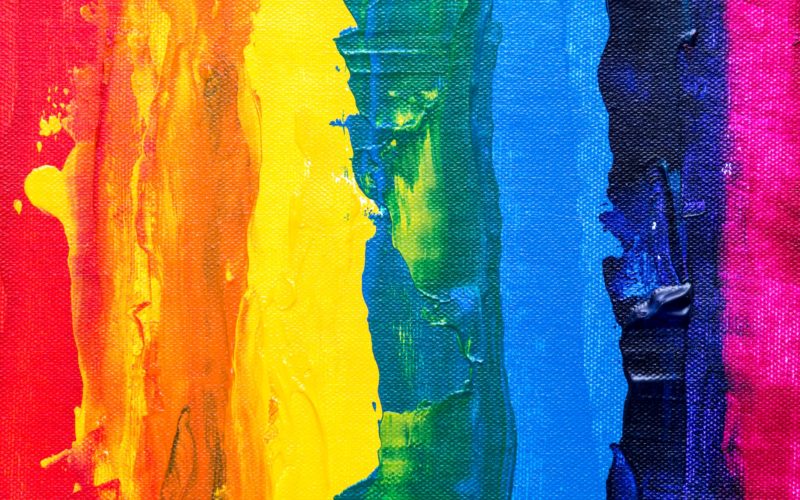
Color plays a vital role in dictating an individual’s emotions and perceptions. This is why the color you choose for your brand, particularly in your logo design, is essential. After all, your logo is the first thing that your audience sees, and depending on the color that you’ve chosen for it, will affect their perception of your brand.
Choosing your logo colors is something that should be decided strategically. This is why most marketers rely on color psychology.
What is Color Psychology?
Color psychology is the study of how colors influence a person’s behavior and perception. Researchers have found that certain colors will elicit a particular reaction or psychological effect on an individual.
Marketers have been utilizing this by choosing a color for their logo design and branding to influence their target audience. After all, according to a study, 90% of initial product assessment is based on color alone. It’s definitely an important factor to consider for your branding especially if you want to increase your conversion rates.
Let’s take a look at the psychology behind common colors and how they affect branding.
Red
Red is frequently associated with boldness, excitement, and passion. If you want your brand to stand out and project confidence and power, then red is the best color for your logo.
Red is known to increase metabolism and encourage hunger. This is the reason why popular fast food brands like Wendy’s and KFC use the color red in their brandings.
Red also increases blood pressure and heart rate. It motivates people to act and is associated with raised urgency. Did you ever wonder why all the “Buy Now!” button is colored red? Now you know why.
Blue
Blue is the color of stability, serenity, and trust. It promotes the feeling of safety and security. This is why blue is a popular logo color choice for banks, government services, pharmaceutical brands, and software companies.
Blue is also the color most preferred by men. If you sell products or services catered to men, consider using blue for your logo to increase your chances of sales.
Blue is used by a lot of corporate businesses and offices since it’s a cool, non-intrusive color. If you can’t decide which color to use for your logo, blue is probably the safest bet.
Yellow
Yellow represents joy and youthfulness. Yellow is known to increase the feeling of cheerfulness and warmth in an individual. Think of Snapchat and the Pokemon logo. They both used the color yellow to fit their younger audience and to signify their fun persona.
Yellow is also an eye-catching color. Brands use it to catch the customer’s attention no matter where they see the logo. Some great examples include McDonald’s, Shell, Post-It’s, BestBuy, and DHL.
Green
Green is the color people associate the most with the environment. For brands related to nature, eco-friendly products, agriculture, or recycling, green is the obvious choice.
Green also symbolizes money and is a color people associate with the wealthy. Finance institutions and banks use the color green for their logo because of this reason.
Green is also known to induce the feeling of relaxation and hope in people. Just like blue, green is a versatile and balanced color that can be used by most businesses, no matter what industry they are in.
Orange
Orange is linked with playfulness, energy, vibrancy, and creativity.
Brands geared towards younger audiences like Nickelodeon frequently use the color orange for their logo. Orange is also a great choice for brands that want to symbolize fun and energy, like Fanta and Cheetos.
On the negative side, orange is linked with the feeling of immaturity and cheapness. If you are a corporate brand, it’s best to steer away from this color.
Purple
Purple is the color of royalty. It is commonly associated with elegance, sophistication, and fantasy. Purple is a great color to use if you want your brand to represent luxury.
The shade of purple is an important distinction too, as darker purple is linked to wealth and glamor while lighter shades like lavender are associated with femininity and beauty.
Purple is best used if you have products or services geared towards women. This is because according to research, 23% of women chose purple as their favorite color while it doesn’t even rank anywhere on the men’s list.
Pink
Pink is widely recognized as the color of femininity. It’s no surprise that the majority of products targeted toward women use pink in their logos. Famous examples are Cosmopolitan, Victoria’s Secret, and Barbie.
Pink is not just limited to women, though, as it is also associated with fun and youthfulness. Brands take advantage of this by using pink to exude a more playful image. Some examples are Baskin Robbins, Pink Panther, and Dunkin Donuts. Insurance company Lemonade also uses pink in their logo design since they want to veer away from the serious image that people usually associate with insurance.
Black
Black is associated with luxury and elegance. High-end brands like Chanel, Cartier, and Gucci use black in their logos for this reason.
Black also connotes power, authority, and efficiency. Tech brands like Apple, Sony, and Motorola use black in their logo to signify those qualities to their target audience. Same with newspapers and media companies like The New York Times, ABC, and BBC.
Black is also a popular choice for sports brands like Adidas, Nike, Converse, and Puma. Aside from color theory, these brands use the color black for practical reasons as well. By keeping their core logo neutral and simple, they can easily adjust its design when making seasonal campaigns or ads.
What color will work for your brand?
Now that you know the meaning behind each color, how will you pick which color is best suited for your brand and your logo?
The first thing to do is to identity your target audience. After all, your logo’s main purpose is to catch your potential consumers’ eye. Are you geared towards a younger or older audience? Are you specifically targeting a male or female audience? Colors are something that can greatly influence these decisions, so based on your answers, choose a color that appeals to them the most to maximize your chances of getting their attention.
It’s crucial to know your brand identity as well. What is your brand’s personality? Are you more playful and fun, or serious and subdued? Are you a luxury brand, or a more affordable option? What message do you want your brand to convey? Knowing all of this is vital in using the correct color for your branding.
Consider what your competitors are using as well. You can either choose a color that is standard in your industry to make your audience subconsciously associate your brand with it, or try to use a wildly different color to stand out.
Key Takeaway
While a logo will contain various design elements like shape, typography, or symbols, its most important element is still the color. The right color will send out the correct message to your target audience, as well as make your brand stand out. As a marketer or a business owner, it’s important to know the psychology behind colors to make informed decisions.
Still, while there is a lot of research and evidence about color psychology and its effects, it’s not all black and white. There’s no 100% guarantee that color will affect every individual the same, as there are a lot of factors at play such as culture, age, gender, and personal preference.
It’s best to do your research and carefully study your brand and your target audience. Then, pick a color that is best suited for you. This way, you’ll design a logo that is memorable, recognizable, and tailored to your brand identity.
⸻

Faviola has been in the digital marketing industry for six years and is currently an SEO Content Writer at BrandCrowd.com. In her spare time, she likes reading mystery novels and watching indie films.