Jennifer Stone is a devoted graphic designer who has dedicated her time and experience to logo designing.
When it comes to building a brand from scratch, business owners are on the run to grab the myriad of opportunities that they think will prove helpful to them. But when you’re able to read between the lines, the differences between building your brand and designing your brand become obvious to the eyes and the mind.
Building a brand is a holistic process that is composed of several smaller procedures. Each step is organized and programmed to transform an intrinsic element into a visual, external reality that guides your audience’s perception. From defining the meaning of your company’s being to aligning your personal values with the brand, building a brand from scratch is easier said than done.
On the other hand, when we’re designing a brand from scratch, only one sense comes to the mind: the vision. As humans are visual creatures, we mainly rely on our sight to guide us.
The design is all about visualizing your brand image and make a reality out of it.
Brand design is a complicated and comprehensive subject. It, also like the brand building process, is composed of several visual and auditory elements, the gravity of which demands a resolute call to action from the clients.

How brand design elements affect your brand ecosystem
According to Philip VanDusen, the Principal of Verhaal Brand Design, brand ecosystem includes each and everything your brand is related to. It involves your personal values, your products, your competitors, your audience, and your relationship with all of them.
Of all the important factors governing the brand ecosystem, the brand design elements are the visual communicators. You must be highly aware that if you’re presenting your brand to your audience, it’s going to go live on several places.
The elements, when combined, are going to touch all the brand aspects termed as ‘brand touchpoints’. These are the areas of your brand that are visible on the surface of any platform, i.e. your content, website, social media, videos, emails, digital marketing, print, and the list goes on and on.
When we talk about brand design elements, you have to keep one thing hardwired in your mind.
You have to keep all your brand elements consistent and in sync with each other to achieve the level of balance on all those touchpoints.
Let’s first take a look at the brand design elements that empower your brand ecosystem.

Brand design elements
- Logo: An excellent logo design is the one which is simple and has a color or two representing your brand’s core messages. The design of a logo should be chosen with care, keeping in mind that it resonates with other brand elements and displays a connection with your brand.
- Fonts: The personality of your brand is also defined by the fonts you use. Depending on what type of business you’re running, you can use a combo of two complementary fonts and use one as a major font that you think will be suitable for your business across other platforms.
- Color Palette: Colors have their own psychology, which is impressively used to manipulate the brain into triggering different responses. Choose as many colors as you want, or stick to the color codes that you believe will be worthy for consistent branding.
- Pattern and Texture: This is one of the key design elements that can help your customers recognize you in the brand market. And this is also one of those areas that most businesses ignore in the due process of their brand building strategy. Think Louis Vuitton and Apple for a moment. The former has their pattern impressed over each of their products, while the latter has a metallic finish on the background of their iconic display.
- Photography and Animation: Studies suggest that people retain 65% of an information after 3 days when it is paired with an image. Photography is loaded with many styles and considering what your brand is about, choose one style and use it consistently throughout all of the brand touchpoints.
- Illustration and Iconography: Like photography and animation, both of these elements are crucial in establishing your brand vocabulary, which can only be achieved via their uniform application on all the brand-visibility platforms.
- Audio: There are a few great examples of brands that use sound as a branding element. If you can remember, Intel uses that specific audio logo that triggers a powerful memory of the brand and surges on top of the mind.
- Layout: Horizontal, vertical, diagonal or kaleidoscopic. Whichever layout style reflects your brand style, use it across all media to boost brand recognition.
- Tone of Voice: The way your brand communicates with your customers reveals how much of a serious or fun brand you are. Determining the brand voice and using it across all brand channels is a way to solidify your brand’s image.
- Personal Style: This is something which isn’t quite necessary but leverages a landmark-type of an impression. If the brand has a personal story behind its origin, the image of the key person or anything related to them can be leveraged to help customers recognize your brand. The most basic case here is that of Col. Sanders from KFC. Even if you don’t know him, his posterized image reminds you of the mouthwatering fried chicken.
How to design your brand using brand design elements
Once you’ve known which brand design elements are included in the ecosystem of your brand, you need to pull them all close and tie them all together to see how they work with each other. The tying force is your brand building strategy. And here are the ways which can help you out with designing your brand from the start.
1. Consistency is the key
The main thing each brand should focus on is the consistency. Watch how Apple, Samsung, or McDonald’s are keeping their brand image alive. They all maneuver their strategies and sync them with other processes of the branding process.

Let’s discuss McDonald’s for a while. The logo is the simple yellow-golden arches with a tagline ‘I’m lovin it’. The color palette consists of two colors: red and yellow. Their signature audio is highly recognizable and the layout is always similar to all of its media representations. The food quality is distinct from its competitors. And the fast-food chain has its famous clown mascot, Ronald McDonald. Now take a look at the chronological performance of the brand. Each element not only works distinctively but also becomes of the bigger picture. The complementary combination is so strong that each element, when performing individually, brings other elements into the picture, hence widening the memory base of that brand in the customer’s mind.
The sole reason for this rock solid branding is consistency in strengthening your brand design elements and connecting them with other brand elements. Eventually, everything connects and works well.
2. Follow brand guidelines
Though brand guidelines are developed in general, it’s not necessary that each brand will have to follow the same rules. There’s no one-size-fits-all approach here. Since the requirements, competition, and industry for every brand varies, each has a specific set of principles and rules that it is obliged to follow.
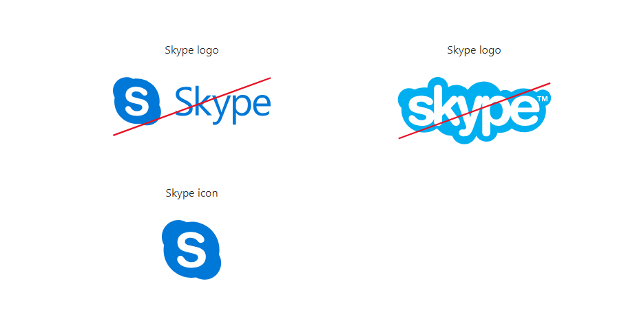
Take Skype brand guidelines, for example. These provide information on the usage of the application, the logo and icon, the sounds as well as permissions on using Skype brand assets.

You can follow a detailed brand guideline framework and build your brand identity. Once you’ve developed a strong foundation, it’s time you merge all your resources, strategies, and efforts into focusing on building your brand. These will help you narrow down your goals, avoid pitfalls, and create a better customer experience. Your brand design depends on the way you apply these guidelines.
3. Audit your brand design
The arrangement of all your brand design elements can be quite overwhelming, which is why it’s necessary to organize and scrutinize the design fundamentals. Use a template to organize where each element should be placed.
See if the color schemes work with the typography and other visual media. Check if the layout is optimized for overall design for all of your brand touch points.
4. Align your brand elements with core values
When going over your brand design elements, you mustn’t forget about linking these design elements with your personal values. The colors, text, tone, and the style of your brand should all form one voice that conveys your brand’s message. Let’s discuss Skype once again here.
Skype uses cyan or light blue as the primary color that softly diffuses into purple followed by pink. The key idea using gradient colors is to provide a sweet, soft, and dream-like experience to the users.
5. Start sharing
As you follow the brand guidelines and keep on building your branding aptitude, you learn a few key steps that help you fine-tune the parallelization process of all the brand components, including the design. Once you see your design elements naturally following the ‘cell-to-organism’ process, you can easily share them across all the platforms and media where your brand will be exposed.
In a nutshell
Branding is a complicated process, but what’s more complex is the organization and structuring of all the design elements. As an entrepreneur or a designer opting to design your brand personality, it’s better to take a roof-top view of the situation and govern the process.
Operate one process at a time as each requires time and resources for functioning fully. Carefully go through each design component and see where your brand design stands. Hope you’ve had taken your cue from the article above. Let me know what you think; I appreciate your feedback!
Author Bio:
Jennifer Stone is a devoted graphic designer who has dedicated her time and experience to logo designing. She keeps a birds-eye view of all the trending news on the logo design desk and writes at LogoDesign.Net. Her hobbies are intertwined with her profession, which allows her to explore her love and passion for graphic design and that’s why she heads for random design on the internet and comes up with creative and easy-to-follow ways of graphic design creation.


