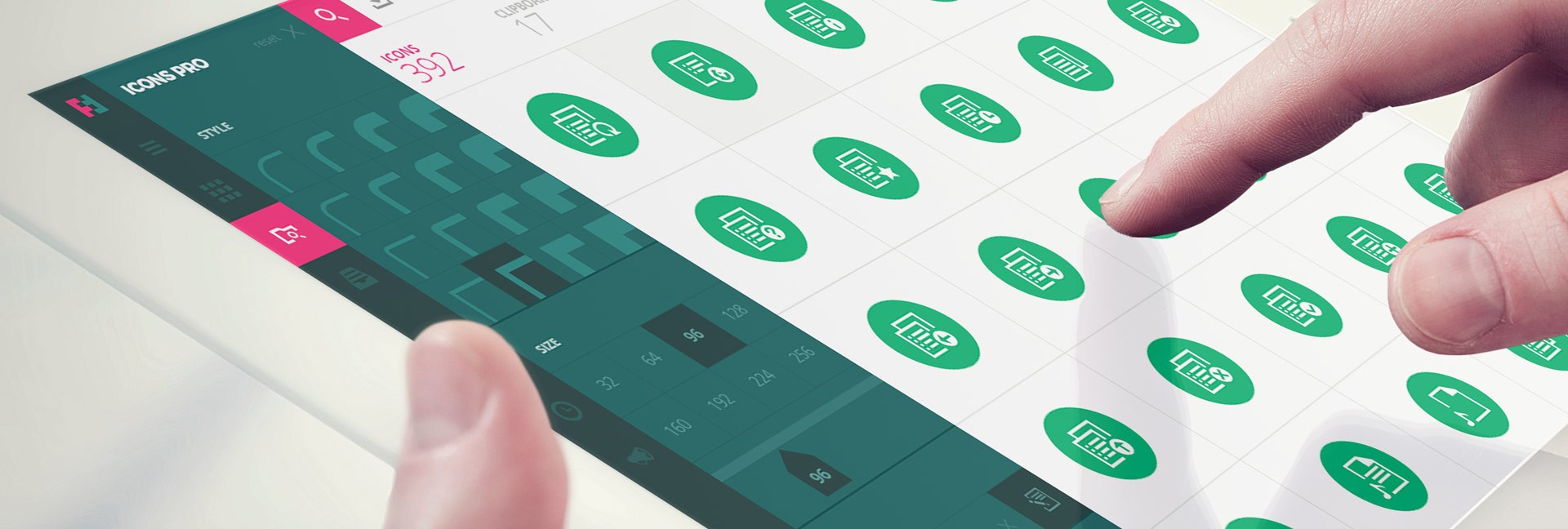
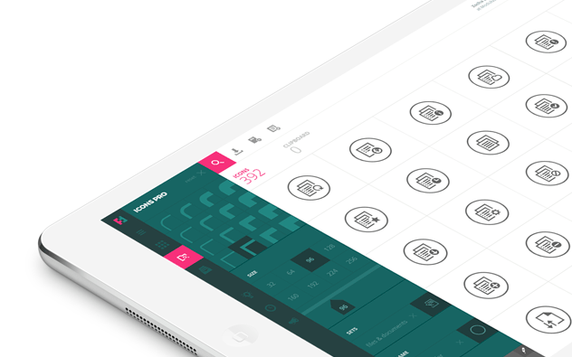
The application, designed and developed by our creative digital agency Modulus, earned a number of design awards and we are thrilled with the reception received from the design and tech community. Building on this momentum we will gradually introduce new features (such as customizable frames or backgrounds and new modern workflows) that simplify tasks for both designers and developers.
Time flies
As a UX+IT driven company we have been lucky to work with some of the greatest companies and partners across the world since, well, the beginning of the WWW. Time flies! This allows us to review work and accomplishments from a different perspective. We are able to connect historical events, which were important for the evolution of design and draw conclusions to the directions where it should evolve.
If design is more of a passion than work – like it is to us – you can make a lasting statement that will be much more than a “trend”. You can be sure that there will be lots of emotions involved. Designing a great product for a top client is quite an emotional matter. But designing your own product is like super-scaling this emotional dimension a 1000 times.
Designing your own product means emotions on super-scale.
tweet this
We know that designers have strong opinions that they are willing to defend in many creative ways. Creating an application for the design community is exposing yourself – your knowledge, your style, your concepts, your theories and more to a critical audience. Being part of the design community yourself does not make that any easier. So with more positive feedback landing in the Futuramo inboxes it was like “Wow, OK, now we can take a deep breath; we did not mess it up after all.”
So do we rest on our laurels? No. Now call us crazy. We decided to redesign the award-winning product – Futuramo Icons.
The unavoidability of redesigning
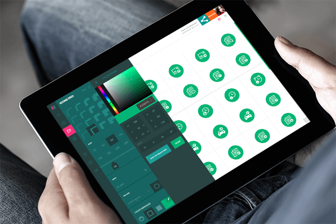
In the following paragraphs we would like to outline aspects of the unavoidability of redesigns in today’s rapidly evolving product design world. To support illustrate this we will walk through design decisions and explain them in more detail. Ultimately we hope you will welcome the changes and recognize them as the next logical step in the evolution of the design of the Futuramo platform.
Redesigning and not losing your soul
There was something very special about the first Futuramo Icons design – after all, it gained so much recognition. The design was different, it had its own character. Like the well known polish artist Duniko laid out in the 1970s “To be is to be different.” At our company we stick to this principle. So we had yet another task in front of us: redesigning without losing our soul.
Futuramo are strong supporters of the idea that every product company should have their own design language, not just a style, not a variation, but a real design language. Designers should learn from experience, but designers also should push the limits. This is the basic foundation of evolution. No one “owns” design. Without true inventions we designers would deprive ourselves of our creative roles which are critical to the evolution of humanity – now more than ever before.

Without true inventions designers would deprive themselves of their creative roles.
tweet this
Just think about it. Templates, patterns – do they solve real problems? Where is the brand communication if the design is based on an anonymous template? Was pattern “x” really the best solution for your individual UX problem? Maybe, but maybe the best solution is still waiting to be invented?
Blindly following trends or predefined design languages is a narrow and dangerous road. Design was never intended to be one size fits all. Maybe with all those templates and patters it is more difficult to get a design really bad. On the other hand, it also makes it harder for those less adventurous to make it really visionary.
Do not take this the wrong way – we definitely support critical style guides for popular operating systems. You would not want to learn every single application’s UI from scratch. You expect certain features to be placed in the areas where you have become accustomed to – which makes your interactions simpler and faster.
Imagine what would happen to your favorite apps if you turned all their UIs the same, if it even would be possible. The unique features make interacting with these applications special. They cannot uniformed, because in most cases if they would, they would lose exactly what makes them so important to you and so easy to interact with in the first place.
Futuramo’s Active Surface
The UI design language and soul of Futuramo – called Active Surface – is a continuously evolving set of interaction ideas and rules (UI/UX/IxD), which are being developed and perfected for over two decades at our UX-focused company. We have undertaken significant research that has helped many clients achieve their goals. Active Surface is not a uniform, it is more like a set of rules and results of many UX analyses. Active Surface does not force us to use a predefined narrow graphical language, it provides creative space for design, but keeps the user interactions in line with the general concept. So Active Surface is the soul on which the specific design language of Futuramo is being continuously developed and refined.
The first signs
Unbelievably the hardest time when you have to start thinking about a redesign comes when you and your users are happy with the application. You keep innovating, moving forward, adding more and more features. All great because they often come directly in the form of user requests, so the application is getting better. But what about the design?
In continuous development also lies a hidden risk. Suddenly you reach a point where the initial design decisions, which made your application successful and stand out from the crowd need to be reviewed. They made perfect sense back then (which actually was not that long ago) and if you make the simple test and look at the first designs, chances are quite good that for the functionality of that time, you might have again decided in exactly the same way.
If you look at an application with all the new added functionality suddenly it becomes clear that it seems overcrowded, not laser-focused enough. Elements that were previously characteristic and formed a great UX because of instant recognizability, now, multiplied by the amount of new features clutter up the UI destroying that recognizability. A design element is only recognizable when it’s soul is maintained, what makes it stand out. As soon as it is multiplied many times its initial recognizability is lost. You have to reevaluate the essence of what is important in the new context.
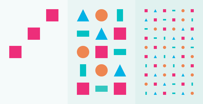
Design decisions may be absolutely right at a given point in time and evolution of an application, but they should be reevaluated when the application moves forward and actually becomes a different design task/problem than it initially was. A great redesign is not to be regarded as a better design in general, but a better solution for the given problem in a specific context at a given time.
The order of human perception rule
Over the years it has always surprised us how many visual designers seem to forget the order of human perception which is:
- Color
- Form
- Content
Color is the most powerful tool in design, followed by form and last place for content. This is something we cannot change – it is absolutely natural for us as human beings. Take a baby as an example and compare them to a computer. The baby cannot do math calculations which represents content in this comparison, but a computer excels in it. Yet the baby can visually recognize the mother, which represents colorand form in this comparison. For the computer the task to “recognize” a person and distinguish it from others is something extremely complex. And yes it involves extreme amounts of calculations. At the time of writing we are just beginning to make progress in this regard with newer AI concepts. So the question arises, how can a baby, who cannot do math calculations make “calculations” to recognize their mother?
The order of the human perception rule can easily be misunderstood. You might have read articles on how content-focused UI design has become with newer evolutions of popular Operating Systems. And that is perfectly fine, but it does not mean the order of human perception has changed in any way. On the contrary, great UIs take into account that content is actually what you want by interacting with the application, but the way to get the content you need, must be proceeded by carefully orchestrated UX design. Again the human perception rule is paramount and will stay that way as long we are… well… humans. If you remember the human perception rule, and use it wisely, you will be a better UX designer.
Design is not only about feeling it and talent, it is also about knowing why.
Color is the best guide
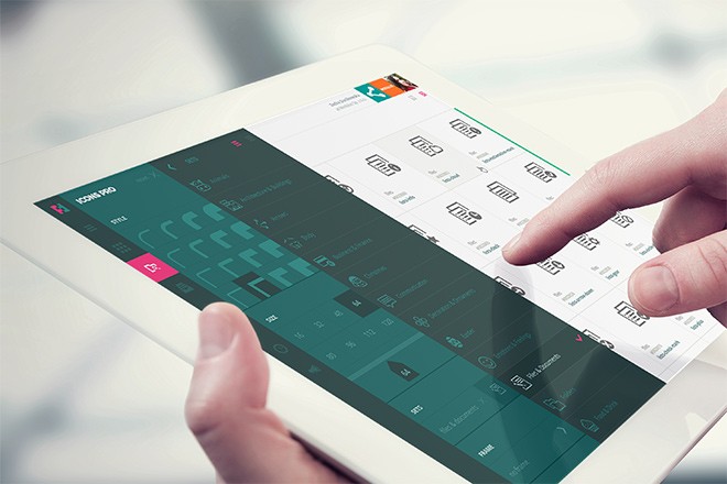
While there are instances for a different approach to UX, primarily color should be used to guide users. This is logical as it takes the first spot on the human perception list it allows users to have an instant initial overview of what is going on – quicker than they recognize forms and long before they understand the content.
So let us make every function and every area pop through different colors! Now that will be a great UX! No, it will not. And it is not only a matter of graphical design it is also a matter of, yes, UX.
As with everything in design, the proportions must be right. No matter which area you take – color, form, content – if there is too much of either of it the recognizability will decrease with every element. The more elements you have on display, the longer it will take to differentiate the elements from one another. So again – we have to use color wisely, because we do not want to lose its power.
With the growing amount of features in Futuramo Icons app represented by their corresponding elements in the UI we had to rethink how to visually structure the app. The initial concept just started to show its limits.
Too much form. Reducing the visual clutter
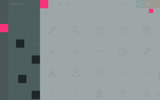
We also reworked the forms language from the artistic design of the first version to a more functional visual system that focuses on the core areas of the UI. We did not want to lose beauty and creativity, so we had to express it in a different way. Similar as with color, again, what worked great for the initial version with its lower amount of functions, was too much, when all new functionality had to be displayed to the user. If you compare a UI to an abstract painting, you will realize that different strategies will result in substantially different user and viewer reactions. When the task is – as with Futuramo Icons – to allow designers and developers to achieve their goals as fast as possible, we have to arrange the visual forms flow accordingly. The more functions an application displays in the UI, the more the forms language must concentrate on the logical division of core application areas.
Content
And now to the final stage: the content. With several measures of visual reduction of the color and forms languages we were able to bring the content closer to the front. So it becomes clear, that the concentration on content in UI design is combination of all the other areas of design, less on the content itself, which might seem a bit of a paradox at first.
Layered cognitive approach
The sum of all those measures we could call a layered cognitive approach to design where each actor comes into play at the right moment in the human perception flow.
We hope we could shed some light in which direction the design of the Futuramo platform evolves and even more so, we hope you like the new concepts and find them a joy to use.
New apps on the way!
Follow @FuturamoApps on Twitter to be the first to know
Mikołaj Dunikowski and Zocha Dunikowska
Founders of FUTURAMO


Mikołaj was among the core team who created Poland’s third largest Internet venue – Interia.pl. Zocha led Czateria.pl from zero to the biggest chat system in Poland (2000–2001). Together: Owners of Modulus – designing for and consulting leading (high profile) world brands (since 1996).
Since 2007 went on to reinvent banking – a concept which became known as Smart Banking.
Now on track to change the Workplace and Business Apps.


