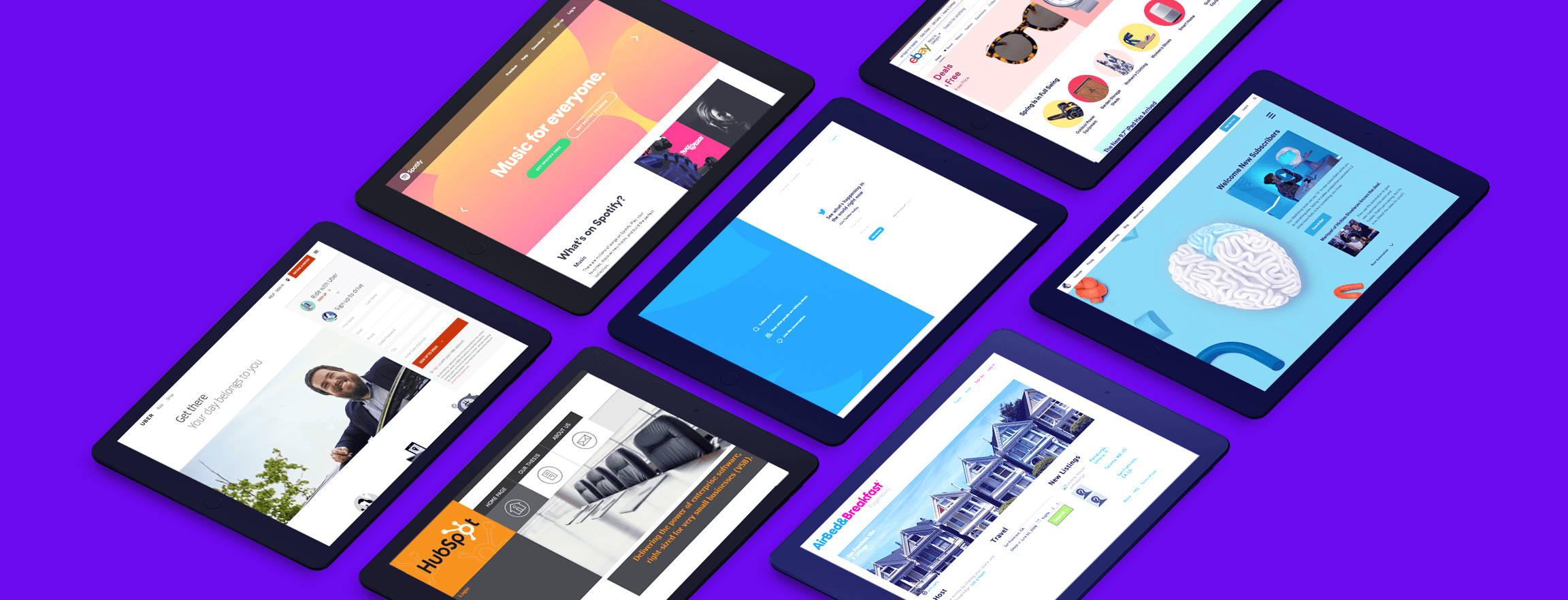
We invite you to a visual travel from 1990 and the first web pages to today’s pixel-perfect masterpieces. Here’s a curated list of popular brands’ websites as we know today and the historical screenshots on how they looked like at the beginning.
Don’t be ashamed to cry! It’s a hell of a memory!
1. Social Media
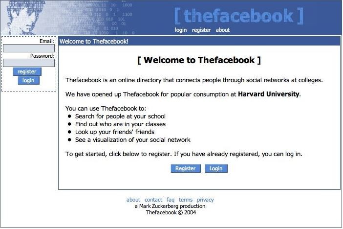
We can’t get over how much work has been done here when reading this Welcome to Thefacebook copy. Facebook’s first focus on college communities was pretty modest when we compare it to the current number of users.
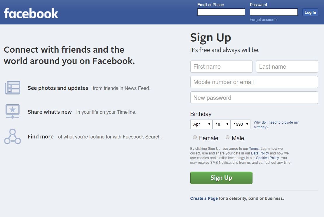
Now, Facebook’s redesigned website is clear, plain and intuitive. They don’t have to explain the benefits of joining the community and don’t bother visitors with too much info about their services (on the signup page).
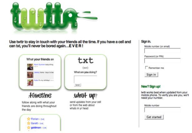
Being among the first 140 users of Twitter must have been an exciting experience (if you have signed up in early 2006, then you’re in that lucky circle!). Evolution of the front page, along with Larry the Bird (Twitter’s logo) is insane.
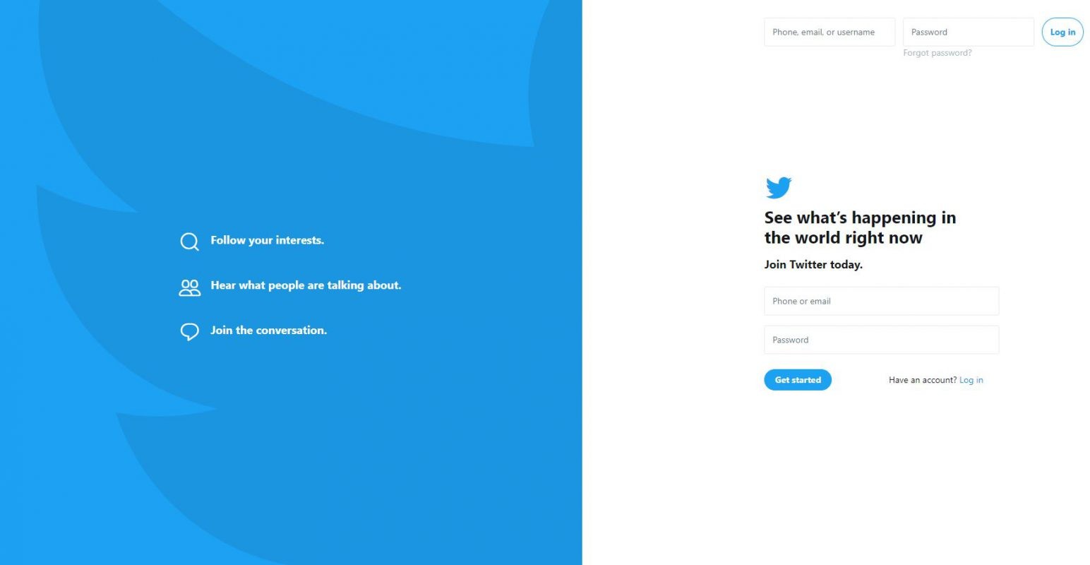
The new landing page shows Twitter global value and influence. After landing here, you are aware that this is the place where c-level talks, the most important announcements, and life-changing declarations happen.
Extra Tip for Logo Design
Redesigning your logo can be quite tricky. If you recently created a logo and you’re not satisfied with the design, then the decision is easy. But what if you’ve held on to your logo for years and you’re not sure whether to redesign it or not? Making up your mind may be harder than you think…
There are three basic ways to design a logo. You can contact a graphic designer, enter a logo contest or use an online logo maker. You may want to consider trying an online logo maker! With a logo maker, you’ll be able to see tones of logo templates which may inspire you. Logo makers also allow you to design your logo by yourself in a few minutes with their online tools.
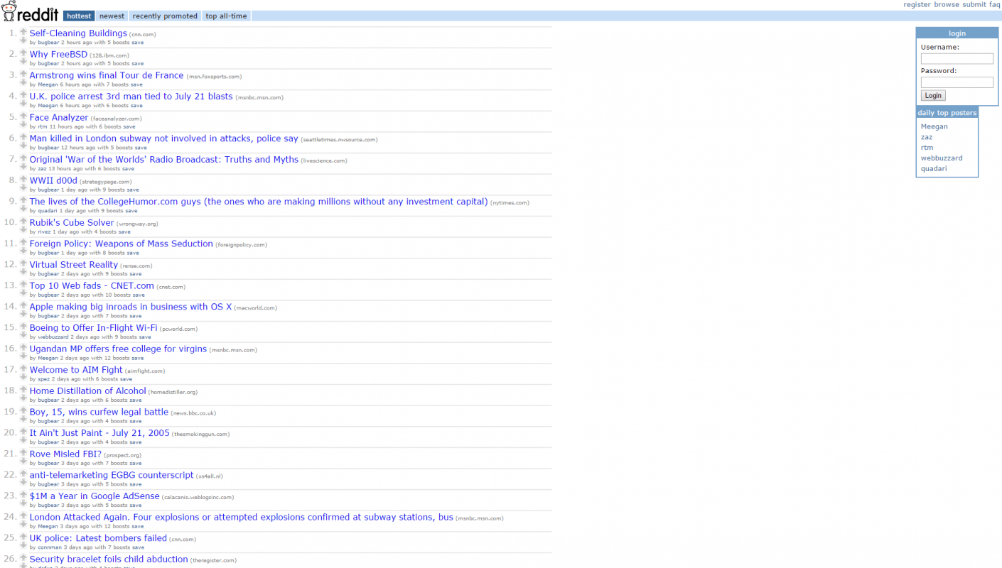
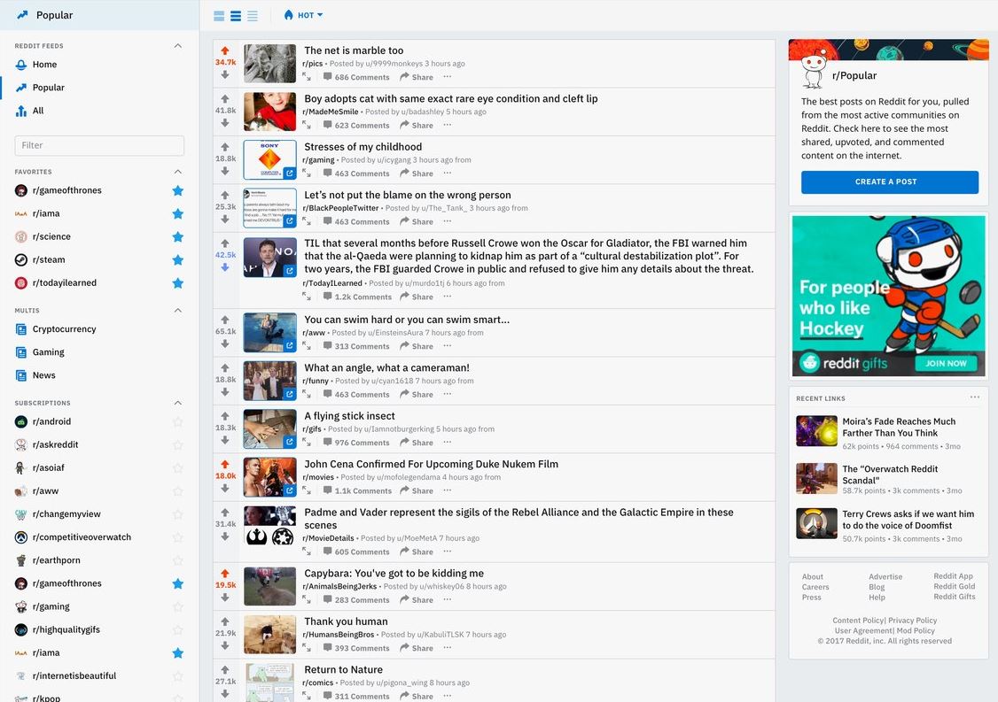
Reddit is the best example of consistency. When comparing their site throughout the years, it is hardly possible to spot any redesign. Their UI is not very modern-looking, but if you were 6th on the list of the most viewed websites globally, would you care?
But lately, the unexpected promise has been made – the new layout is ready and will be gradually displayed to more users. Can’t wait!
2. Sharing economy
Airbnb
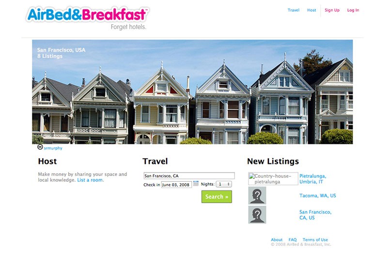
The screenshot of the first Airbnb’s website shows exactly which styles and colors were trending a decade ago.
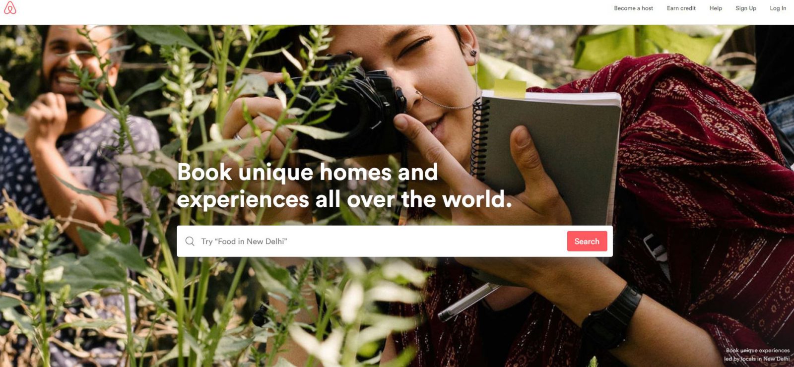
Airbnb’s website is the best example of a visual communication design. Short slogans and copy, great typography and high-quality images are worth clapping!
Uber
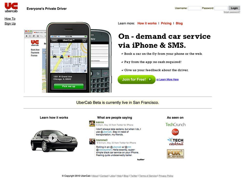
The BlackBerry mockup on the website? It’s a great reminder of how long Uber is in business. Their webpage was content-savvy those days as they had to explain what on-demand car services are.
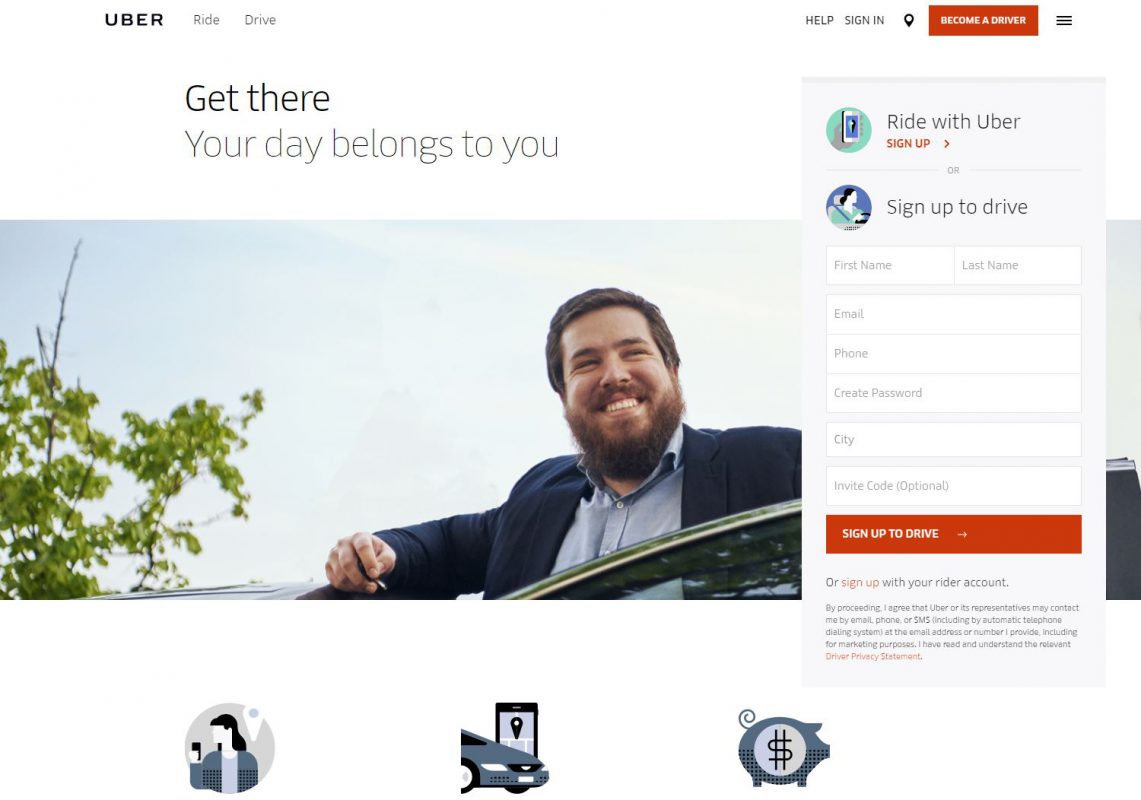
As well as Uber’s business model, their brand and visual identity have evolved from UberCab to the most popular ride-sharing company.
3. Marketing and sales tools
Salesforce
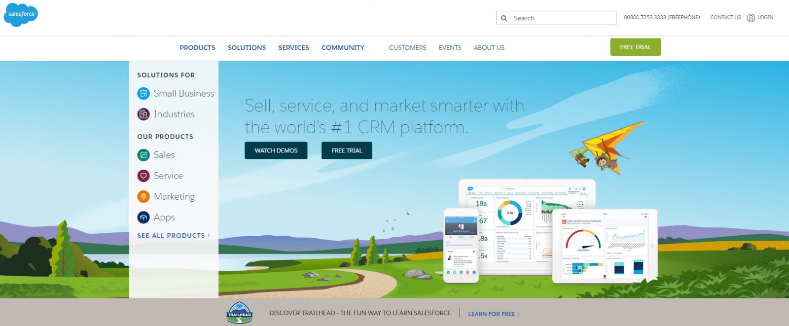
Salesforce has begun a SaaS revolution which allowed many business titans to be born.
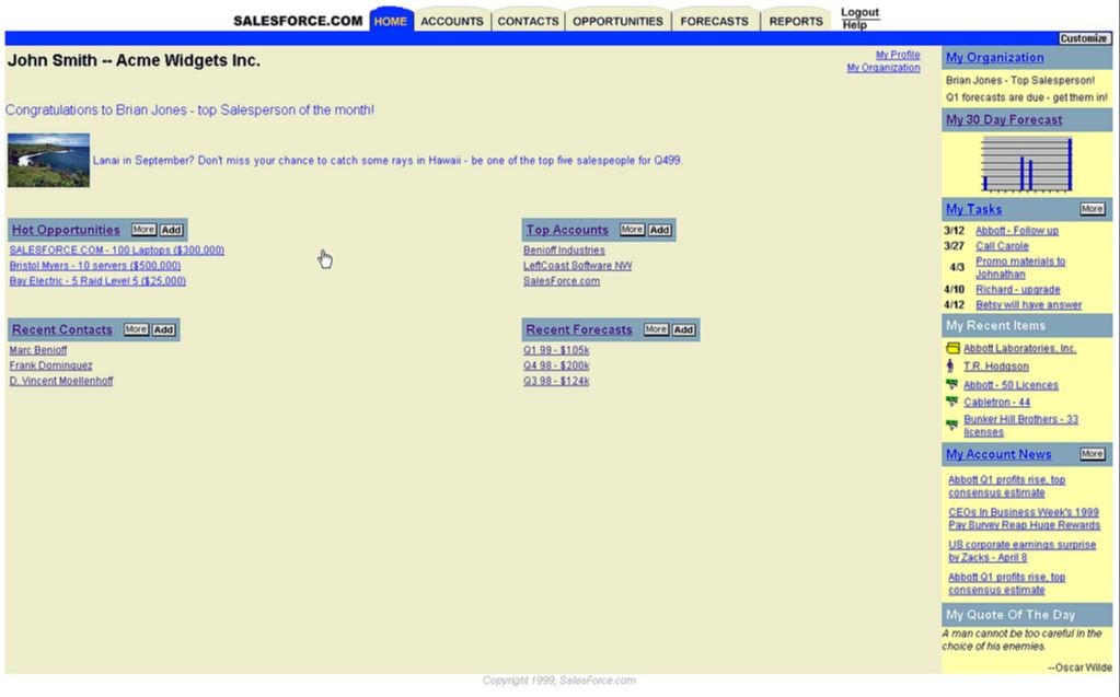
The story of Salesforce lets you discover both – a SaaS history at its best, and the development of web design. Main takeawaysfrom the redesigned webiste? Less content, precise description of the product benefits and great visualization.
MailChimp
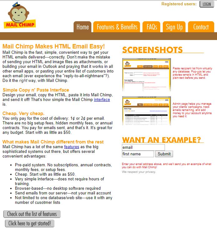
MailChimp is not only a veteran of the email marketing but also a SaaS long-time player. Think of how many emails have been sent via MailChimp since 2001 and that colorful site.
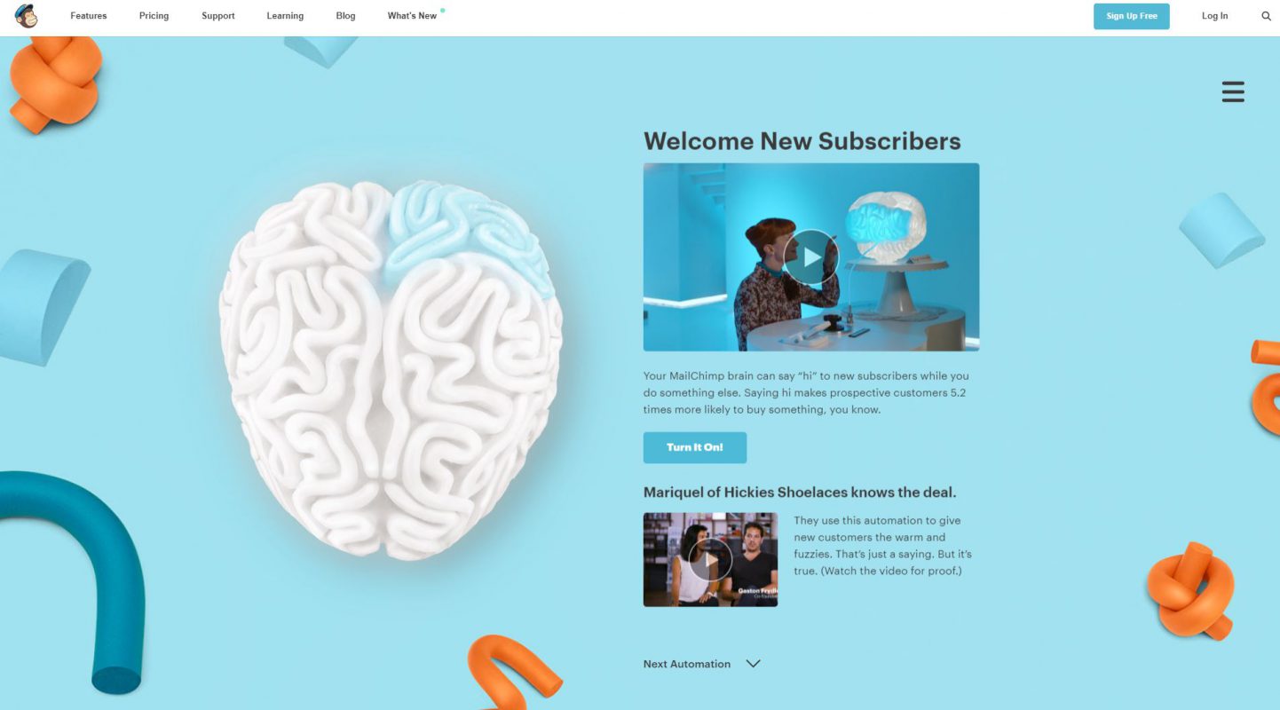
The modern Mailchimp’s front page is great but we need to show you this: check out the Second Brain page and play with these animations. Amazing experience!
Dropbox
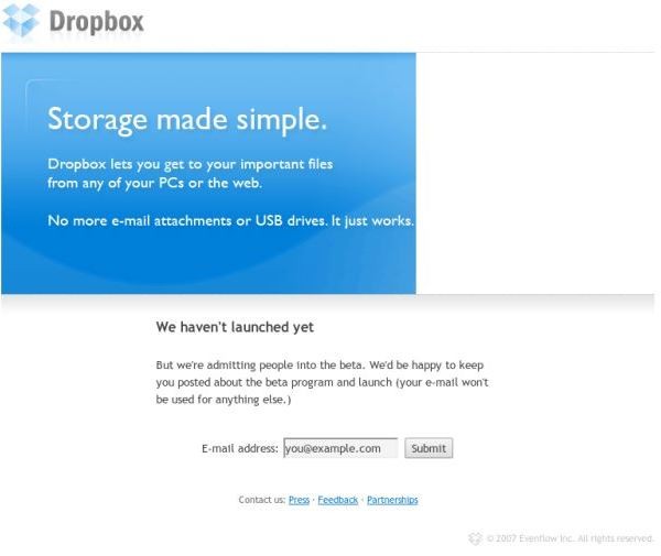
Have you been among Dropbox early adopters? Or someone invited you via their referral program? That first landing for beta testers is a true reminder of the Dropbox beginnings and the start of the easy file-sharing era.
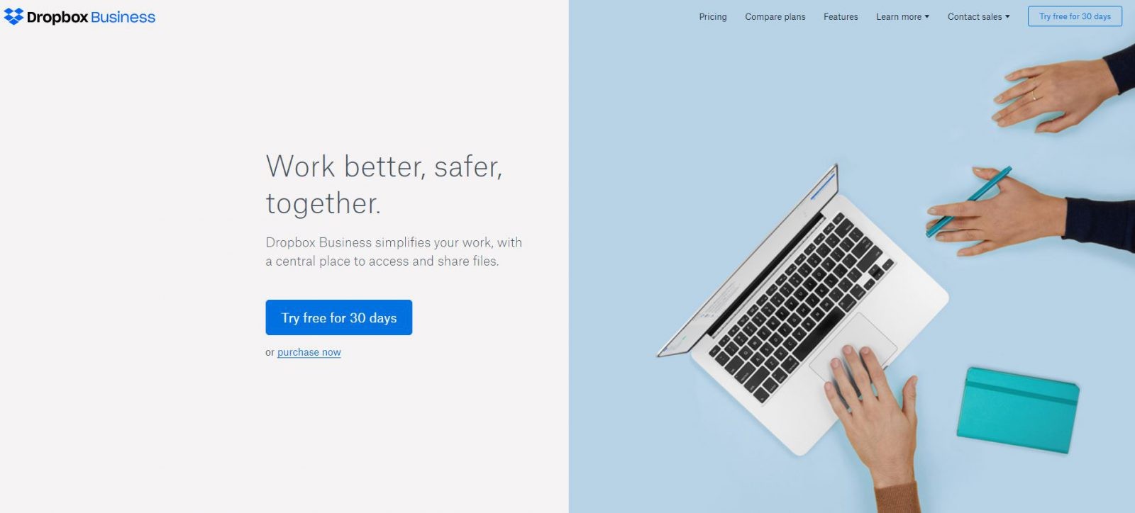
Recently, the design team behind Dropbox has done a captivating job. The latest Dropbox redesign offers a cool combination of colors and intuitive information architecture.
HubSpot
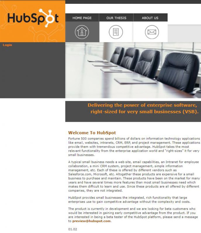
Since the first days of being in business, HubSpot has been taking care of their online presence. The innovators’ job is difficult as they had to educate their visitors about the importance of inbound marketing and its benefits for small businesses.
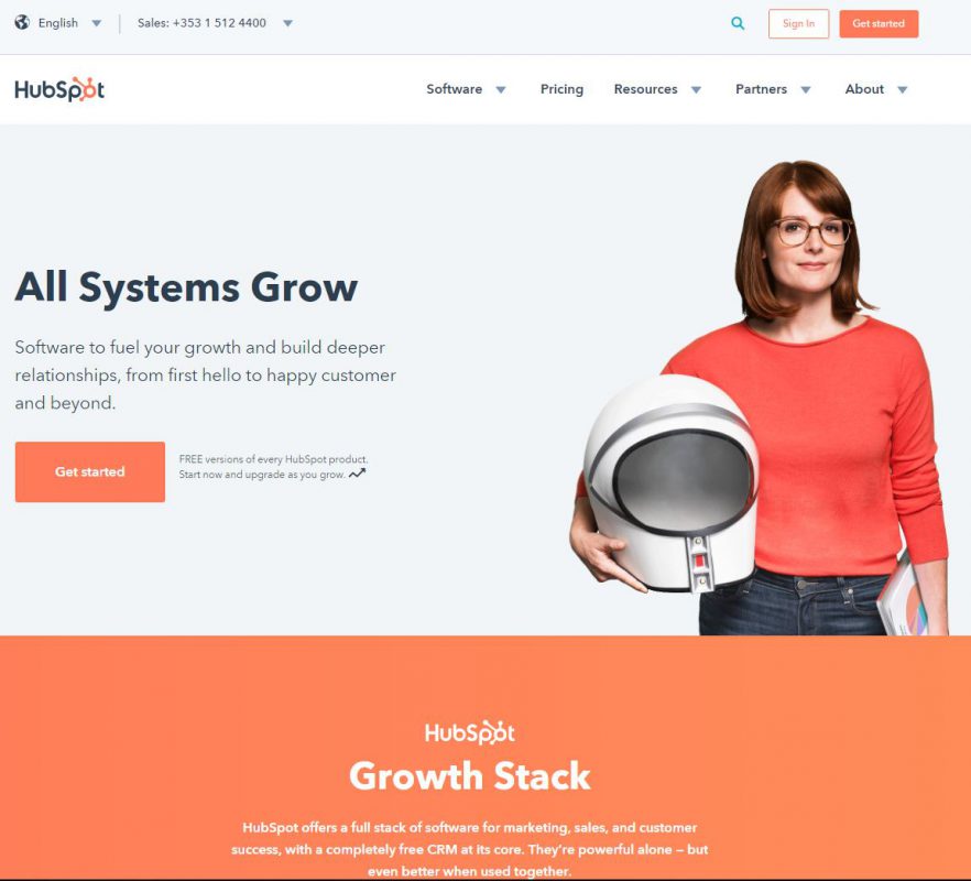
12 years later HubSpot’s redesigned website is still a few steps ahead of the competition. They still help small businesses grow but their toolkit and customer base have changed tremendously.
4. eCommerce
Amazon
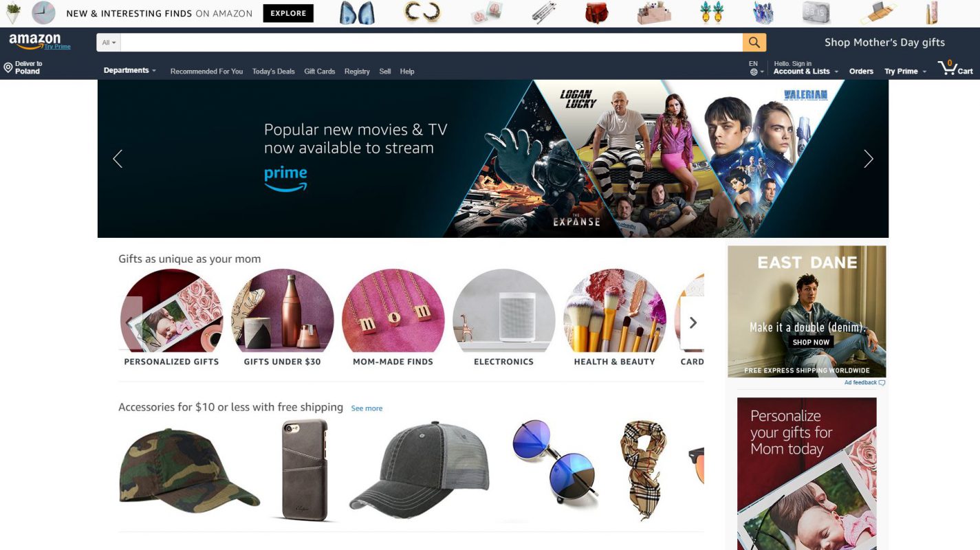
A classic Cinderella story – from an online bookstore to the multi-industry giant. The screenshots of their website might look ridiculous for the younger audience that doesn’t remember the Internet in the mid-90s.
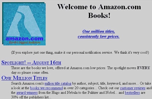
Amazon has grown to be the biggest player in the e-commerce sector with the strongest online presence – their redesigned website is also a representation of their endless offer. Its enormous marketplace is a go-to place for basically anything you need.
eBay
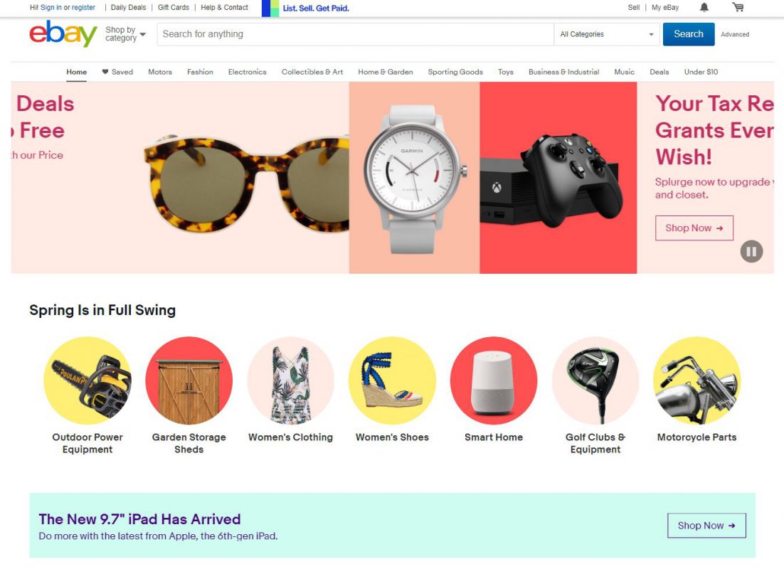
Did you know that eBay was meant to be a website for collectors to sell and buy collectibles?
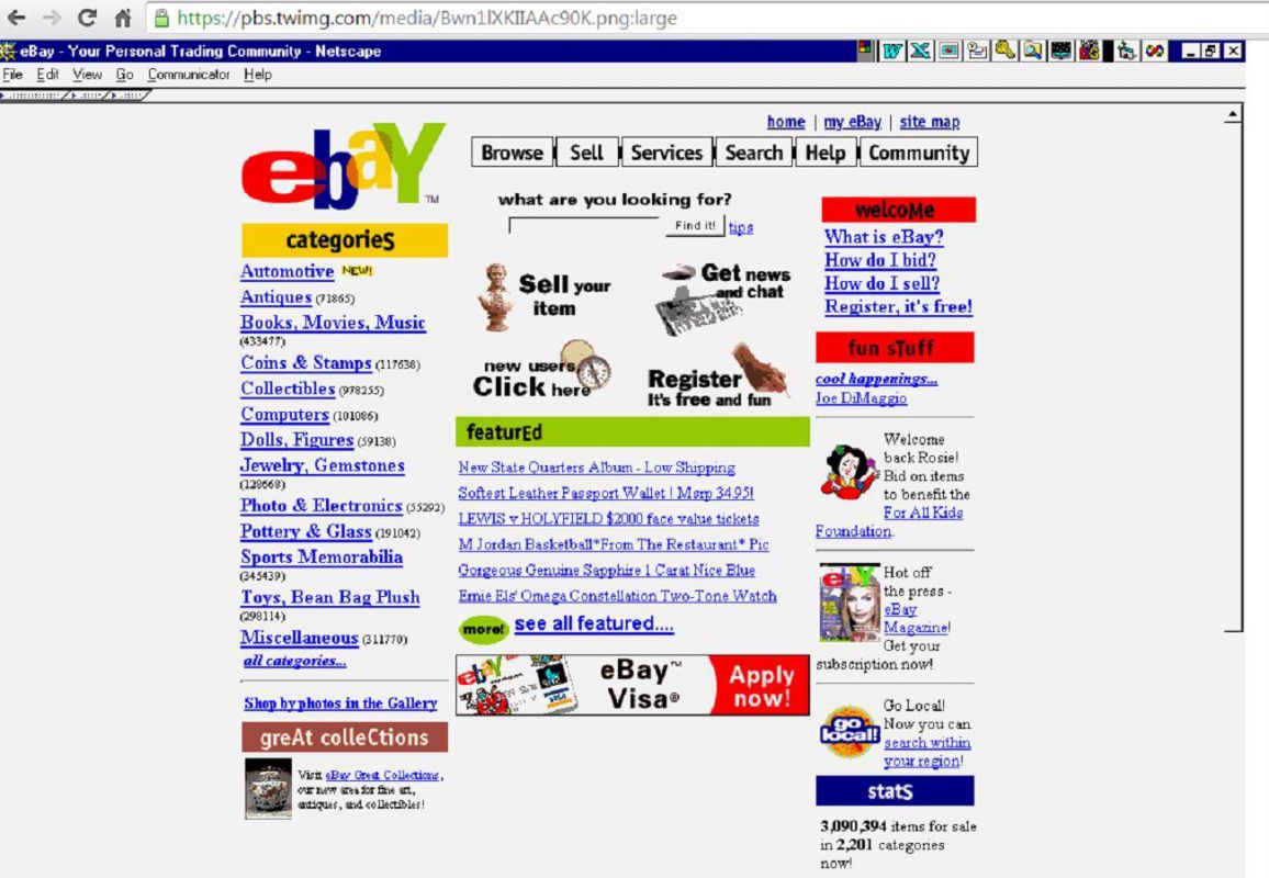
Those collectors are still very active among eBay users, but now the company targets much wider audience. Their website is massive but still responds to the latest changes in design.
Shopify
Back in 2004, the Shopify founders had an idea for an online store. However, it was their in-house developed e-commerce software that turned out to be the product worth selling. And so the Shopify was born.
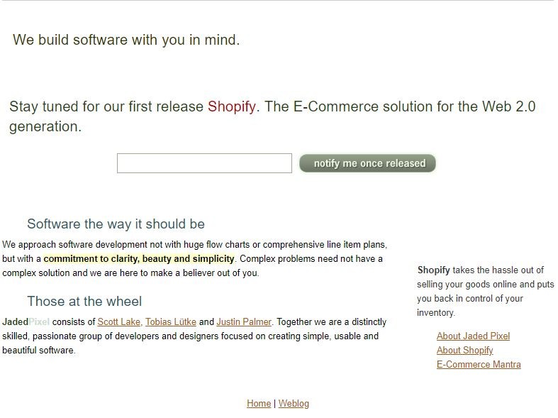
Clearly, first users were waiting patiently for the platform’s service.
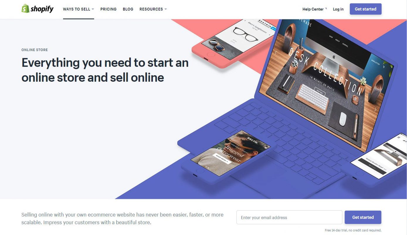
Now you don’t have to wait in a queue to get Shopify’s end-to-end e-commerce service. The redesigned website is a complete toolkit for retailers and its visual quality is astonishing. If this process looks too complicated for you, you can always find reliable Shopify companies that can do the heavy lifting for you.
5. Entertainment
YouTube
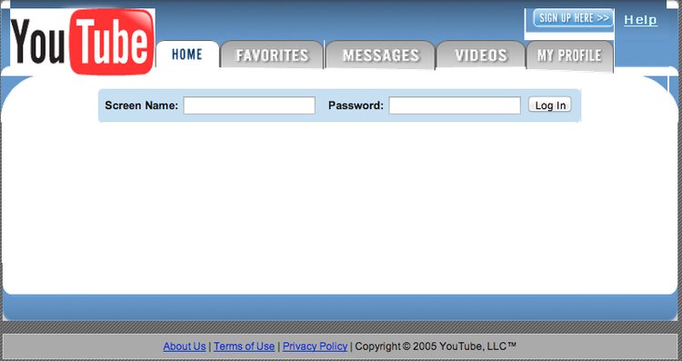
Watching videos on YouTube is an essential part of our daily routine – that’s why it’s so hard to notice changes in the UI. Its visual identity hasn’t changed much throughout the years.
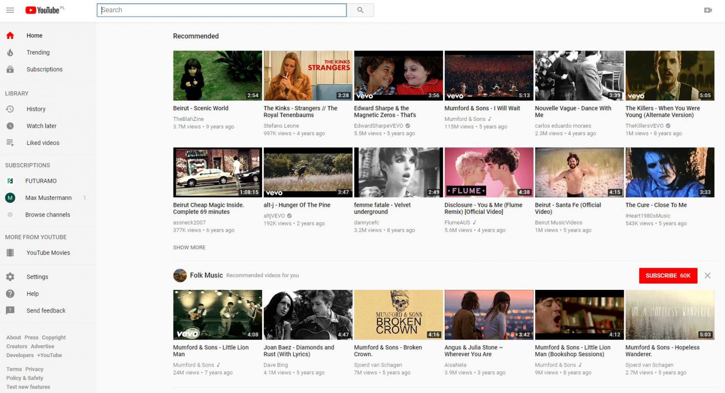
The current YouTube’s welcome page is ever-changing and adjusting accordingly to your search history, so everyone gets their own personalized landing page.
Spotify
They’ve started the music streaming service in 2008. However, the early adopters were encouraged to join the beta in 2007.
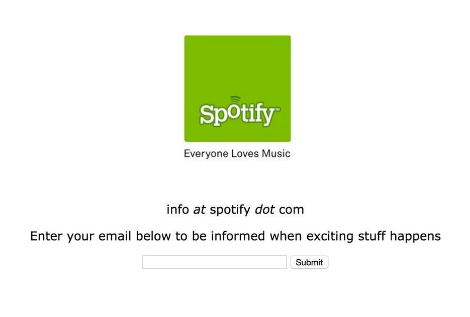
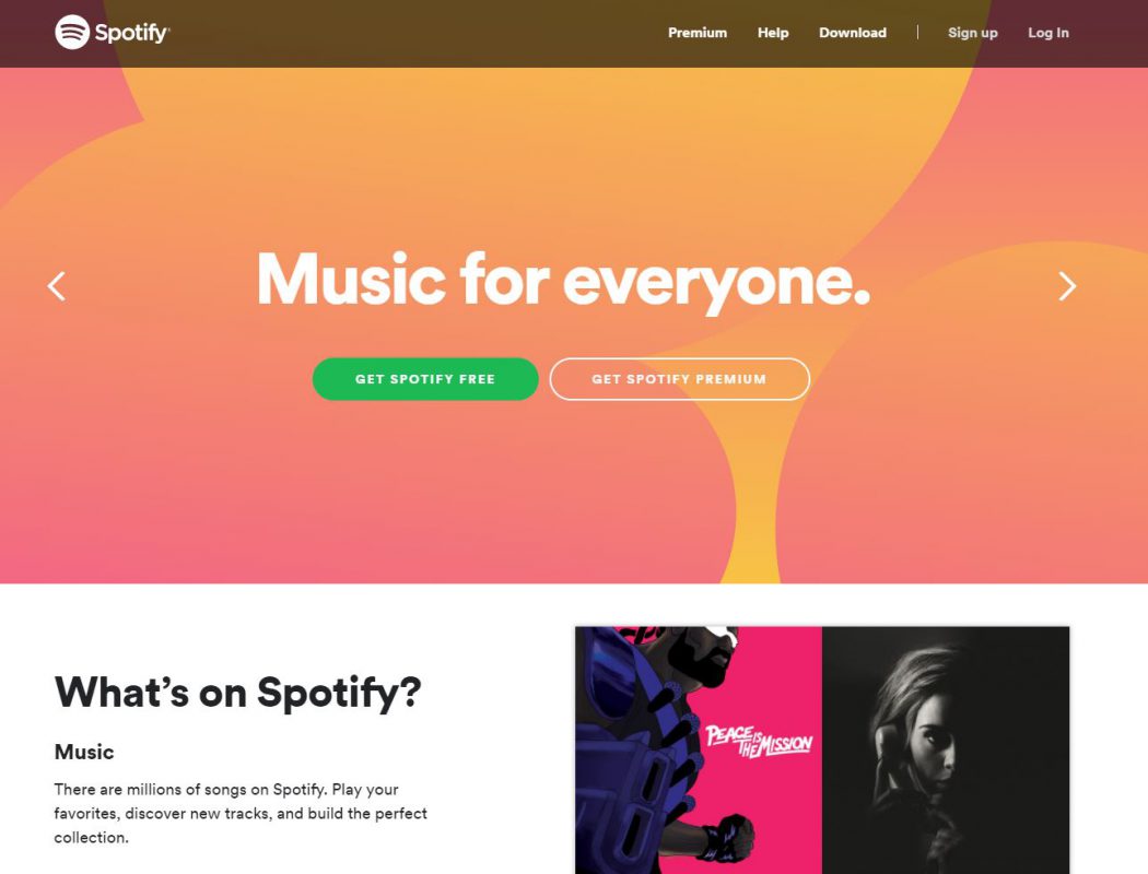
Now, after over a decade of development, the redesigned website shines and is often considered a benchmark for music-related businesses. It follows the today’s trends in design with its subtle animations and perfect typography.
Summing up
This nostalgic overview of the most famous online brands illustrates the development of the Internet business in the last decades (you can check out more examples using Wayback Machine).
All the modern tech giants started small and their websites were as good as they can possibly be that time. Now, their stories depict the processes of developing a great visual identity and branding.


